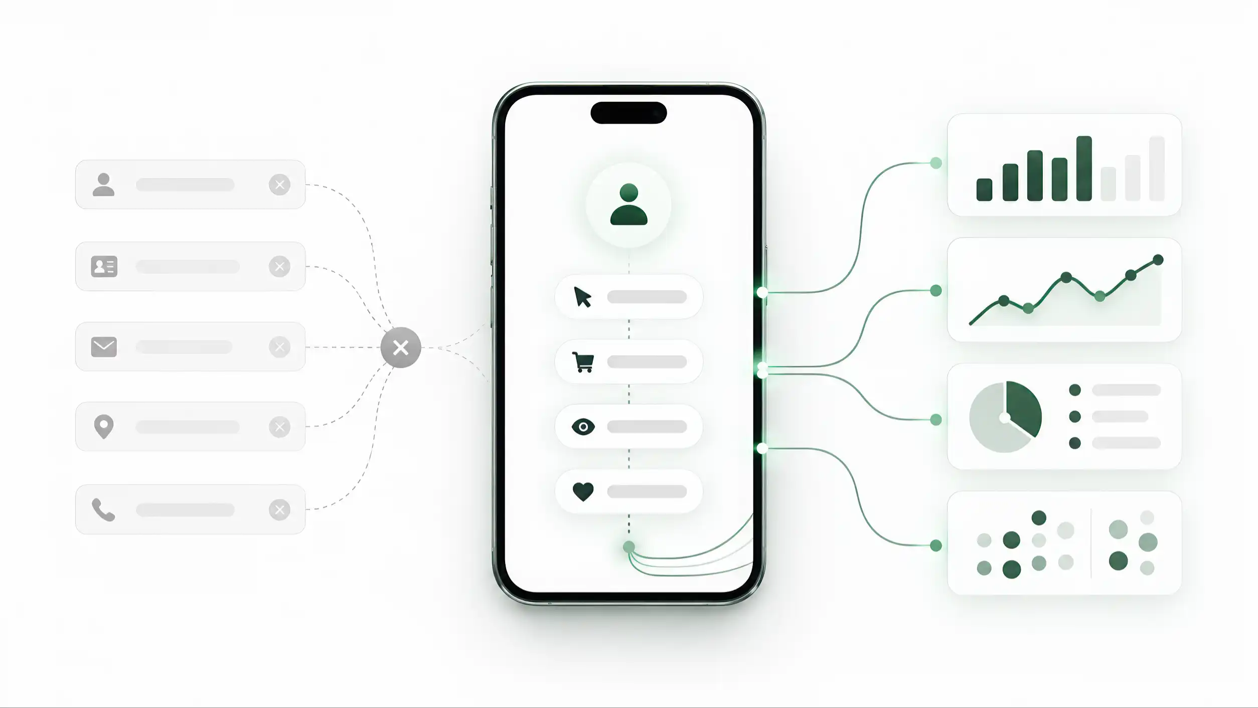
The first task is orientation
The first task of a first screen is orientation. Before a visitor can judge an offer, save a contact, open WhatsApp, or read a service list, they need to know where they have arrived. That sounds obvious, but many digital profiles make the visitor assemble the answer from scattered clues: a logo with no explanation, a portrait without a role, a company name without a category, or a decorative headline that says very little about the person or business behind it.
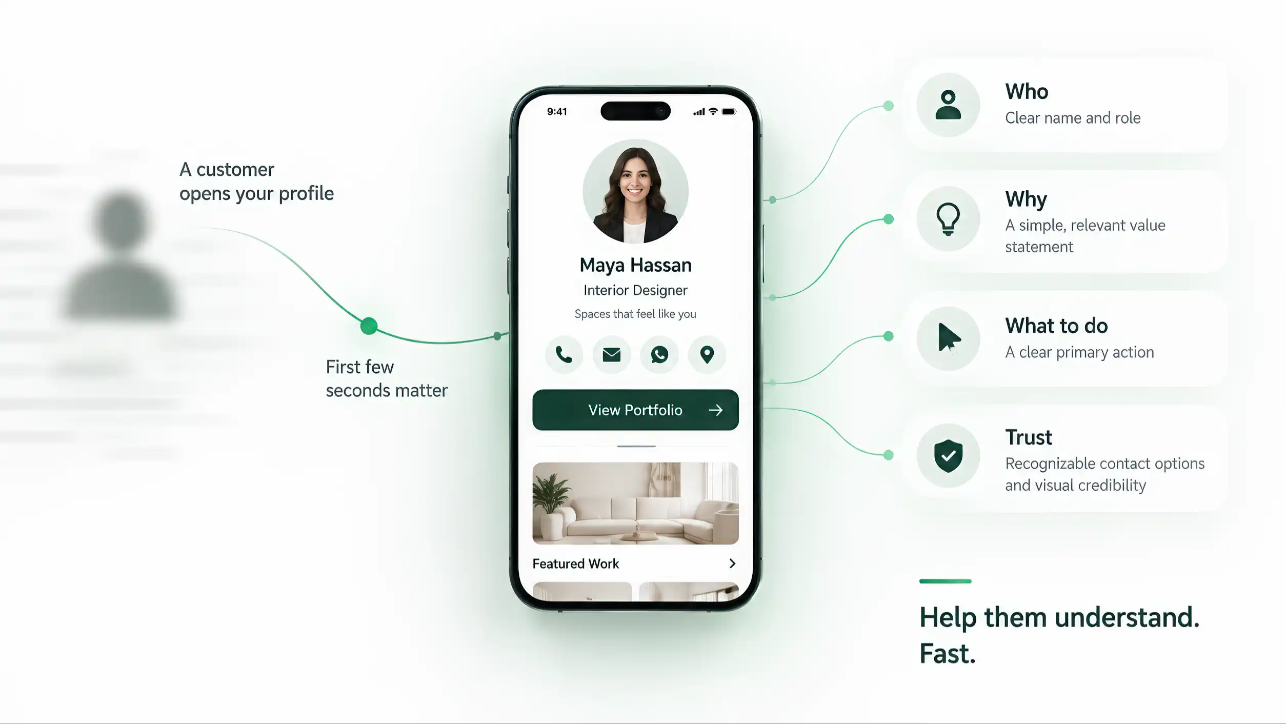
Good orientation uses a small set of strong anchors. The visitor should be able to identify the person or organization, understand the role or business category, and recognize the purpose of the page without scrolling through several sections. A name alone is often not enough. “Maya Hassan” tells the visitor who; “Maya Hassan — Interior Designer” begins to explain why the profile may matter. A restaurant name becomes more useful when the location or category is visible. A service business becomes easier to understand when the top of the page says what it actually does.
Steve Krug’s usability principle—do not make people spend unnecessary effort figuring out the interface—applies directly here. The first screen should not behave like a puzzle. The user’s attention is limited, and the page should spend that attention on the business message rather than on basic decoding. Orientation is therefore functional, not decorative.
Context from the entry point can help, but it should not be required. A person may have scanned a QR stand in a restaurant, tapped an NFC card after a meeting, opened a forwarded link in WhatsApp, or returned from browser history later. By the time the profile appears, the physical or social context may be weaker than it was at the moment of entry. The page should still explain itself.
A useful first-screen test is simple: remove the navigation history from your mind and look only at the visible viewport. Can a new visitor answer three basic questions—who is this, what do they do, and why am I here—without guessing? If not, the problem is usually not a lack of content. It is that the identity anchors are weak, delayed, or competing with elements that matter less.
Orientation does not require a large hero, a long introduction, or a crowded header. It requires the right information to appear early, in a hierarchy that a human can scan quickly. Once the visitor is oriented, the rest of the profile can do its job.
Relevance comes before detail
Relevance comes before detail. The first screen is not a compressed version of the entire profile; it is the point where the visitor decides whether the page deserves more attention. That decision becomes easier when the page presents the information most useful to the current visitor before presenting everything the owner wants to say.
A common mistake is to treat completeness as the same thing as usefulness. A long biography, every service, several social links, awards, certifications, a gallery, a map, a PDF, and six buttons may all be legitimate content. Showing all of them with similar visual weight at the top does not make the profile more informative. It removes priority. The visitor must then decide what the business itself has not decided: what matters first.
A stronger first screen usually combines identity with a concise relevance statement. The statement does not need to be advertising language. It can be a plain description of the role, offer, audience, or location: what this person does, what this business provides, or what this page helps the visitor accomplish. The goal is not to persuade with a slogan; it is to reduce uncertainty.
Don Norman’s work on human-centered design is useful here because understandable interfaces make important possibilities visible. The page should help the visitor form a correct mental model quickly. If the profile is for a consultant, the top should make the consulting role and next useful action obvious. If it is for a restaurant, the immediate relevance may be the menu, location, reservation, or opening context. If it is a pet profile, identification and owner contact may outrank every decorative detail.
This is also why “above the fold” should not be treated as a rigid instruction to force everything into one viewport. Screen sizes vary, browser chrome changes the visible area, and accessibility settings can enlarge text. The principle is priority, not pixel perfection. The most important identity and action cues should appear early; secondary proof and detail can continue below.
Visual hierarchy does the editorial work. Size, spacing, contrast, grouping, and order should tell the visitor what is primary without requiring a tutorial. One clear heading is more useful than three competing headlines. One short value statement is more useful than a paragraph that begins with company history. A visible primary action is more useful than a row of equally loud icons.
The question for the first screen is therefore not “How much can we fit?” It is “What does a new visitor need before the rest of the profile becomes worth exploring?” That question produces a cleaner interface because it begins with relevance rather than inventory.
Alt text EN
Clean first screen showing identity, short value statement, and one primary action before secondary details
Trust is built from small, consistent signals
Trust is built from small, consistent signals. A digital profile rarely earns credibility through one badge, one testimonial, or one impressive photograph. Visitors form a judgment from the way many details fit together: whether the identity is coherent, whether information is specific, whether links work, whether the language is understandable, whether the page loads securely, and whether anything feels obviously unfinished or contradictory.
This makes trust partly an interface-quality problem. A polished layout cannot compensate for a phone number that fails, a broken website link, an outdated role, a placeholder image, a misspelled service, or a button whose label does not match its destination. Each inconsistency forces the visitor to update their judgment. The page begins to feel less controlled, even if the underlying business is legitimate.
Jakob Nielsen’s usability engineering work emphasizes error prevention, learnability, and reliable interaction. For a profile, that translates into practical checks: links should lead where their labels promise; contact actions should use current details; visual states should not imply functionality that does not exist; and important information should not appear differently in two nearby places without a reason. Trust is strengthened when the page behaves predictably.
Proof should also be proportional. A real credential, verified review source, portfolio example, location, or company domain can support credibility when it is relevant. But adding every possible trust symbol above the fold can backfire by making the page look promotional or defensive. The first screen needs enough evidence to avoid doubt, not a wall of claims.
Specificity is often stronger than generic confidence language. “Licensed physiotherapist in Abu Dhabi” gives the visitor something concrete to evaluate. “We deliver excellence and innovation” gives almost no orientation. A professional email domain, a clearly named role, a consistent brand identity, and a working location link can do more for trust than decorative seals whose meaning is unclear.
Trust is also affected by restraint. Aggressive pop-ups, auto-playing media, unexpected redirects, flashing buttons, or a request for personal information before the visitor understands the page can create friction before the relationship has begun. The first screen should earn the right to ask for attention or action.
The practical standard is not “make the page look expensive.” It is “remove reasons for doubt.” Check the facts, destinations, language, security, images, and action labels as one system. When those small signals agree, the visitor can focus on whether the offer is relevant. When they conflict, the interface consumes attention defending its own credibility.
Speed is part of the first impression
Speed is part of the first impression because the visitor experiences waiting before they experience design. A profile reached through a tap, scan, message, or shared link carries an expectation of immediacy. The entry action may take a fraction of a second; a destination that then stalls behind a blank screen, heavy animation, or late-loading hero can make the whole interaction feel slower than it technically is.
Performance should therefore be considered alongside layout, not after the visual design is finished. The first useful identity information and primary action should become available as early as practical. Large decorative video, oversized imagery, multiple font files, third-party widgets, carousels that initialize before useful content, and scripts that block rendering all compete with the part of the page the visitor actually came to see.
Google’s current web performance guidance uses Largest Contentful Paint (LCP) as one of the Core Web Vitals. LCP measures when the largest image or text block in the viewport is rendered, and current guidance treats 2.5 seconds or less for at least 75% of page visits as the “good” range. The number is not a substitute for user testing, but it provides a concrete reminder: the largest visible part of the first screen should not arrive late for most real users.
The design implication is selective loading. A hero image that helps identify the person or product may deserve early priority. A gallery ten sections lower usually does not. A decorative background should not delay the name, role, and action. If animation is used, the meaningful content should not depend on waiting for the animation to finish. Critical text should remain in the initial page structure rather than appearing only after avoidable client-side work.
Perceived speed matters too. Stable layout is preferable to controls that jump after images load. A visible, usable action is better than a skeleton screen that looks active while the real interface remains unavailable. The page should avoid making a visitor tap an element that moves at the last moment or wait for a button to become interactive after it already looks ready.
Network conditions also vary. A profile that feels instant on office Wi-Fi may feel very different on a busy mobile network, roaming connection, or older phone. First-screen QA should therefore include throttled or weaker conditions, not only the developer’s desktop.
A fast first screen is not about chasing a benchmark for its own sake. It is about protecting the continuity of the interaction. The visitor tapped or scanned because they wanted something now. The profile should respect that momentum by delivering useful identity, context, and action before secondary media competes for bandwidth.
One primary action is stronger than ten equal actions
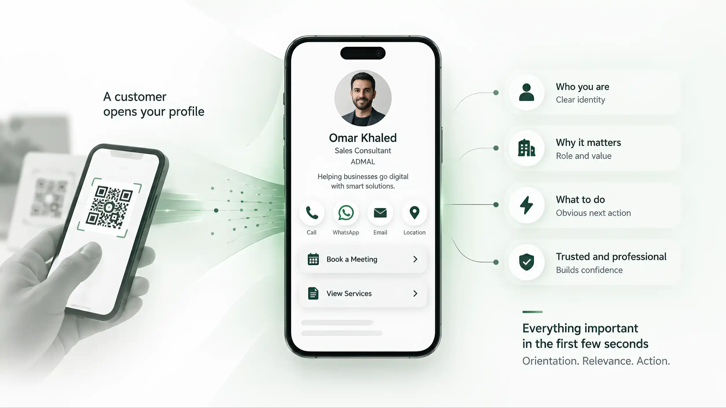
One primary action is stronger than ten equal actions because hierarchy reduces decision work. A profile can legitimately support WhatsApp, phone, email, booking, directions, website, contact saving, reviews, social channels, downloads, and more. The problem begins when every action is styled as equally urgent on the first screen.
The primary action should reflect the main job of that profile, not the feature the designer happens to like most. A consultant may want a qualified booking. A sales representative may want a call or WhatsApp conversation. A restaurant may want the menu, directions, or reservation route. A networking profile may prioritize saving contact details. The correct action changes with the use case.
Giving one action priority does not require hiding the rest. Secondary actions can remain visible in quieter positions, groups, or later sections. What matters is that the interface communicates a recommendation: if the visitor is interested, this is the most useful next step. Without that recommendation, the page transfers its own prioritization problem to the visitor.
Labels matter as much as button color. “Contact” can be ambiguous if several contact methods appear nearby. “Book a consultation,” “Open menu,” “Save contact,” or “Get directions” tells the visitor what will happen. Clear labels reduce uncertainty before the tap and make the interface easier to scan. Icons can support recognition, but the icon should not carry the full meaning when the action is important.
Don Norman’s emphasis on discoverability and understandable mapping applies here. The control should look actionable, its label should match the result, and feedback should confirm that the interaction occurred. A button that looks disabled, a link hidden inside body text, or an important action styled like a decorative chip weakens the hierarchy even if the underlying function works.
The primary action should also remain context-aware. A review stand and a business card may connect to the same identity system but deserve different first actions. A returning user may need something different from a first-time visitor. The broader identity architecture belongs elsewhere in the series; the first-screen rule here is simpler: the action presented as primary should match why this particular entry point exists.
Avoid measuring quality by the number of buttons above the fold. Feature availability is not the same as interface quality. A mature profile can contain many capabilities while presenting only one obvious next step at the moment of decision.
When the main action is clear, secondary content becomes easier to organize around it. The first screen stops looking like a menu of everything the platform can do and starts behaving like an interface designed for a real customer task.
Alt text EN
One highlighted primary action among several quiet secondary actions
Use progressive disclosure instead of a biography wall
Use progressive disclosure instead of a biography wall. The first screen does not need to prove every claim, list every credential, or expose every available link. It needs to provide enough information for the visitor to understand the profile and decide whether deeper information is worth opening.
Progressive disclosure means revealing complexity in stages. The initial layer carries identity, relevance, a small amount of proof, and the primary action. The next layer can explain services, qualifications, products, reviews, portfolio work, location details, FAQs, downloadable files, or other evidence. The visitor gains depth when they need it instead of receiving the full information architecture at once.
This is especially important on mobile because long blocks at the top do more than consume space: they push the useful action farther away. A five-paragraph biography may be excellent content for someone evaluating a specialist, but it is a poor first obstacle for someone who only wants to confirm the role and send a message. The solution is not to delete depth; it is to sequence it.
Disclosure should still be honest. Important limitations, prices when they are essential to the decision, safety information, or conditions should not be intentionally buried behind many interactions. Progressive disclosure is an information-hierarchy technique, not a method for hiding inconvenient facts. The question is whether the detail is necessary for orientation or better presented when the visitor asks for more.
Expandable sections can help, but they are not automatically superior. If every line is inside an accordion, the visitor must repeatedly open containers to understand the page. Important content can also remain directly visible below the first screen. Use interaction only when it genuinely reduces complexity.
The same principle applies to visual media. One strong image near the top can support identity. A full gallery, certificates, product images, or review screenshots can live deeper in the profile. Loading and presenting them later keeps the opening experience focused while preserving evidence for visitors who want it.
A useful editing exercise is to label every first-screen element as one of four things: identity, relevance, proof, or action. If an element fits none of those categories, ask why it must appear before the visitor scrolls. Some elements will still have a reason, but the exercise exposes decorative or duplicated content quickly.
Progressive disclosure protects both simplicity and completeness. The visitor sees a clear opening rather than a compressed brochure, while the profile still has room to answer serious questions. The design becomes layered instead of shallow: simple at the point of entry, detailed when the user chooses to investigate.
Design for a thumb, not a presentation slide
Design for a thumb, not a presentation slide. A digital profile is usually opened on a small touchscreen, often while the user is standing, walking, holding another object, or using one hand. The first screen therefore has a physical interaction problem as well as a visual one.
Important controls need enough size and separation to be activated reliably. WCAG 2.2 includes a Level AA Target Size (Minimum) criterion requiring pointer targets to be at least 24 by 24 CSS pixels, with defined exceptions including sufficient spacing. W3C also notes that larger targets can help many users and that touchscreen users, people with reduced dexterity, one-handed users, and people operating devices in unstable environments can all benefit from easier targets. A design can technically pass a minimum and still feel cramped; important first-screen actions deserve comfortable hit areas.
Spacing between controls matters because errors are costly. If “Call” sits directly beside “Directions” or another high-impact action, a slight thumb movement can trigger the wrong result. On a profile the consequences may be small, but accidental taps still create friction. Buttons should be visually and physically distinguishable, and sticky controls should not cover the content or each other.
Text also needs to survive real devices. A layout that looks balanced at 430 pixels may wrap awkwardly at 360. A long Arabic label may require more horizontal space than its English equivalent. Browser text enlargement can turn a neat row of controls into a collision. The correct response is not to shrink the type until it fits; it is to let the layout adapt.
Do not rely on hover to explain an action. Touchscreens do not provide the same hover behavior as a desktop pointer. Important meaning should be visible in the label, icon, or surrounding context before the tap. Similarly, tiny icon-only actions may look elegant in a mockup but become ambiguous in use.
Fixed elements need restraint. A sticky call-to-action can keep the primary action reachable, but it can also consume a large part of a short viewport, cover form fields, conflict with browser controls, or stack badly with cookie notices and accessibility tools. Test the complete page, not the component in isolation.
The first few seconds include the hand as well as the eye. A visitor may understand the page perfectly and still struggle if the target is small, the button moves, the label wraps unpredictably, or the important action sits outside the comfortable interaction area.
Mobile quality is therefore not a scaled-down desktop aesthetic. It is a set of decisions about readable text, resilient layout, reachable controls, sufficient spacing, and predictable behavior under real touch input.
Test the first screen before adding more to it
Test the first screen before adding more to it. Teams often respond to uncertainty by adding another badge, another explanation, another button, or another piece of proof. That can make the page feel safer internally while making the experience harder externally. A better response is to test what the existing first screen communicates.
The simplest review is the three-question exercise: show the first viewport briefly and ask, “Who is this?”, “What do they do or offer?”, and “What should I do next?” The exercise is not a universal scientific benchmark and should not be presented as one. Its value is diagnostic. If several people answer differently, the hierarchy may be sending mixed signals.
A stronger review adds task questions. Ask a person to call, book, save the contact, open the menu, or find the location without coaching. Watch where the first hesitation occurs. Do not explain the design while testing it. The moment you explain which button is primary or what a label means, you are testing your explanation rather than the interface.
Jakob Nielsen’s usability engineering approach is useful because evaluation does not have to wait for a large research program. Small, structured tests and heuristic review can reveal obvious problems early. For a first screen, the team can inspect clarity, consistency, error risk, discoverability, and mobile interaction before investing in more visual decoration.
Test several viewport widths and both supported language directions where relevant. Check common mobile widths, text enlargement, weak network conditions, logged-out public viewing, and the real entry routes that customers use. If a QR stand is an important route, scan the actual stand. If NFC is used, tap the physical item. If the link is commonly forwarded through WhatsApp, open the forwarded link. The interface should be judged in the context in which it is reached.
A screenshot test can also be revealing. Capture only the initial viewport and remove surrounding browser history from the reviewer’s mind. The screenshot cannot test interaction, but it exposes hierarchy: what dominates, what competes, and what disappears. Then perform the live interaction test to catch target size, loading, and behavior problems.
Create a short acceptance checklist rather than relying on taste. Identity is obvious. The role or offer is clear. The primary action is visible and correctly labeled. Important facts are current. No element blocks the page. Text is readable. The layout does not jump unexpectedly. The first useful content appears promptly. Secondary elements do not compete with the main job.
The final question is not whether the first screen is impressive. It is whether it removes enough uncertainty for the visitor to continue confidently. When that standard is met, adding more content should require a reason. The default should be to protect clarity, not fill empty space.
Sources
- Don't Make Me Think, Revisited: A Common Sense Approach to Web Usability, 3rd edition — Steve Krug — New Riders / Pearson
- The Design of Everyday Things — Revised and Expanded Edition — Don Norman — Basic Books
- Usability Engineering — Jakob Nielsen — Morgan Kaufmann / Elsevier
- Understanding Success Criterion 2.5.8: Target Size (Minimum) — WCAG 2.2 — W3C Web Accessibility Initiative (WAI)
- Optimize Largest Contentful Paint — Philip Walton, Barry Pollard — web.dev / Google Chrome