A successful scan only proves that the code was readable
Masahiro Hara and the DENSO team developed the QR Code in the 1990s because conventional barcodes were becoming a bottleneck in manufacturing. The original problem was practical: workers needed to read more information, more quickly, from compact symbols. Hara’s team solved that recognition problem by designing a two-dimensional code with position-detection patterns that scanners could locate rapidly. The result was technically elegant and eventually became familiar far beyond factories.
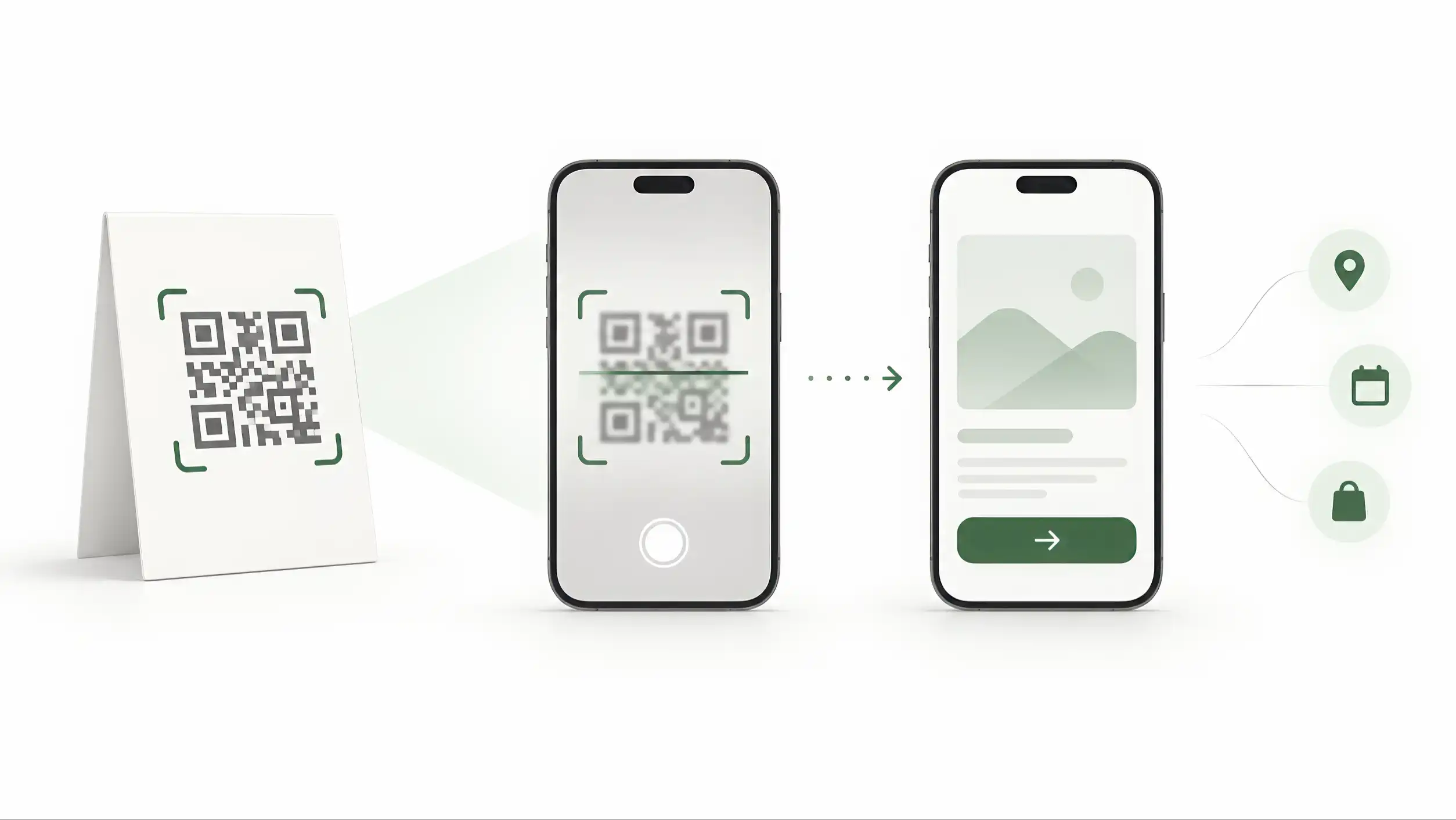
That history is useful because it clarifies what a QR code is very good at. It is a machine-readable entry point. A camera or scanner recognises the symbol, decodes the stored data, and gives the user access to whatever has been encoded. In many customer-facing cases, that data is a web address. The symbol solves the problem of getting from a physical object to a digital destination without typing a URL.
But businesses often make a conceptual mistake at exactly this point. They treat a successful scan as proof that the QR experience worked. It is not. A scan proves that the code was visible enough, readable enough, and encoded correctly enough for the device to recognise it. It does not prove that the page loaded quickly, that the visitor understood what they had reached, that the content matched the physical context, or that the visitor found a useful next step.
Imagine two QR codes printed perfectly. Both scan on the first attempt. The first opens the exact menu a restaurant guest expected. The second opens a generic homepage with a promotion, a navigation menu, and no obvious path to the menu. Technically, both codes succeeded. From the customer’s perspective, only one interaction succeeded.
This distinction changes how QR should be evaluated. The physical symbol and the digital destination are separate layers in one journey. The symbol must be readable and appropriately placed. The destination must honour the reason the person scanned. If either layer fails, the experience feels broken even if the other layer is technically sound.
For that reason, the first question in a QR project should not be “Can the phone scan it?” That is only the technical floor. The stronger question is “What happens immediately after the scan, and does that result solve the user’s actual task?” Once teams adopt that standard, QR stops being treated as decoration or novelty and becomes a deliberate interface between a physical context and a digital action.
The physical context creates the promise
People rarely scan a QR code without clues about what it should do. The object, location, surrounding message, and moment of use create an expectation before the camera is even opened. A QR code on a restaurant table suggests a menu, ordering path, or bill. A code on a review stand suggests a review flow. A code on a business card suggests identity and contact. A code on product packaging suggests information about that product, not the company’s corporate history.
This is why the physical context should be treated as part of the interface. The printed environment is not merely a container for the symbol; it is the first screen of the experience. It tells the visitor why scanning is worth the effort and what kind of result should appear next. When the digital destination ignores that promise, the user has to recover from a mismatch that the QR code was supposed to eliminate.
The more specific the context, the more specific the destination should usually be. A sign that says “See today’s menu” creates a narrow expectation. Sending that visitor to a generic homepage forces them to find the menu themselves. A stand that says “Leave a review” should not open a profile page where the review option is one of twelve equal buttons. A product label promising care instructions should not open a brand landing page that makes the customer search for the product again.
Steve Krug’s usability principle of reducing unnecessary thinking is especially relevant here. When people use a QR code, they have already accepted a small interaction cost: they noticed the symbol, decided to scan, opened or used the camera, and aimed the device. The destination should reward that effort by continuing the same task, not by starting a new navigation problem.
This also means that copying the same QR destination across every physical placement is often a weak shortcut. One digital identity can remain consistent while different contexts emphasise different first actions. A business card can prioritise contact. A review stand can prioritise reviews. A table card can prioritise a menu. The underlying business can be the same while the immediate job changes.
A useful design test is to cover the QR code and read only the physical message around it. What would a reasonable person expect to happen after scanning? Then open the destination and compare. If the first meaningful screen does not satisfy that expectation quickly, the journey is misaligned.
The strongest QR implementations therefore begin with context mapping, not with the code generator. Teams identify where the code will appear, who is likely to scan it, what that person is trying to accomplish at that moment, and which digital destination best continues the task. The symbol comes later. Its job is simply to connect the two.
The destination should solve the task, not advertise everything
Once a QR code has been scanned, the destination inherits a very specific responsibility: continue the task with as little friction as possible. This sounds obvious, yet many QR journeys fail because the page is designed around what the business wants to show rather than what the visitor came to do.
A company homepage is often built to serve many audiences at once. It may contain navigation, campaigns, corporate messaging, product categories, careers, social proof, announcements, and several calls to action. That can be reasonable for a general website visit. It is often the wrong answer to a contextual QR scan.
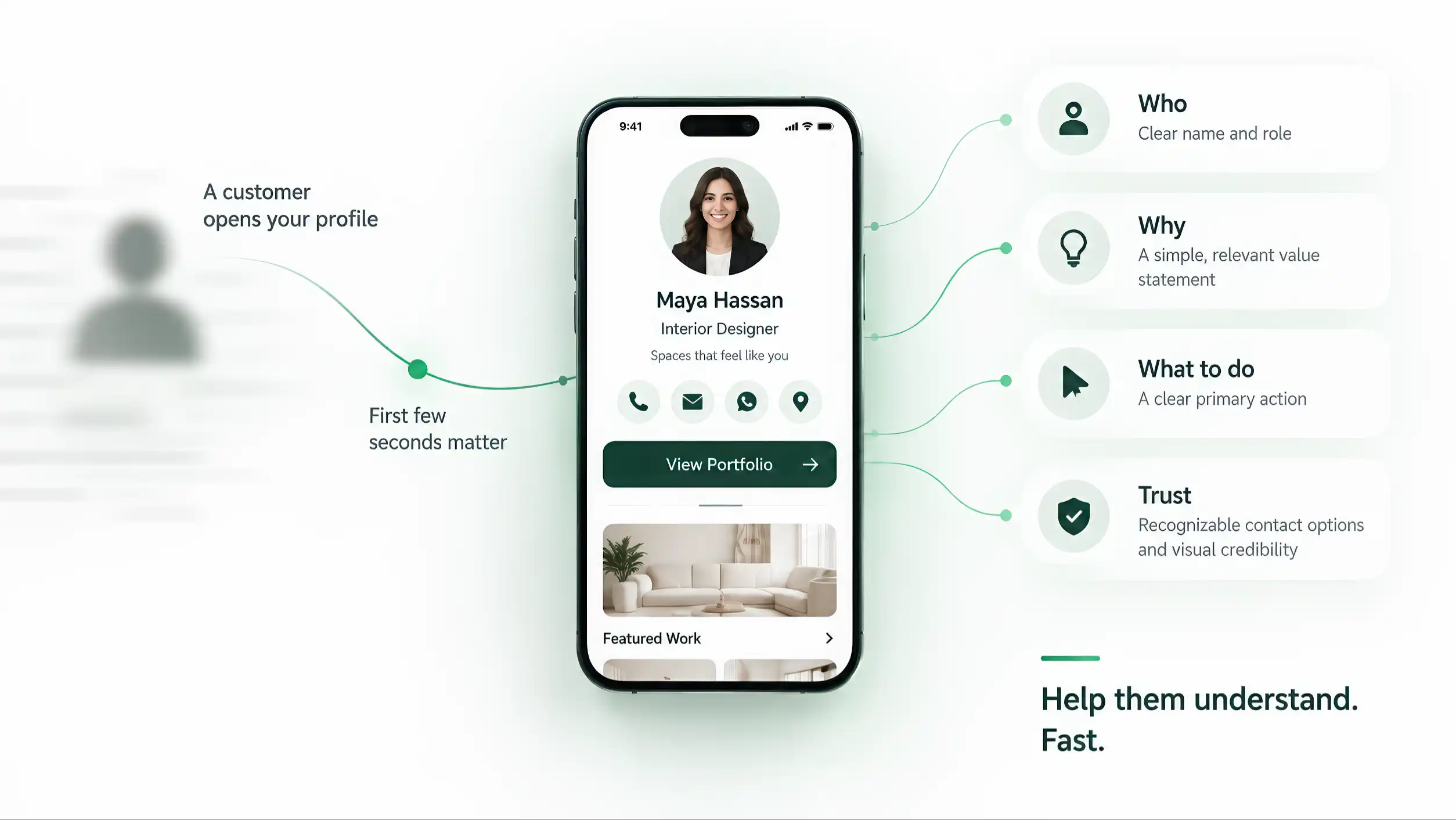
The scan has already narrowed intent. Someone who scans a menu code is not asking for a corporate overview. Someone who scans a product tag is not necessarily looking for the company’s careers page. Someone who scans a business card has already met the person or encountered the identity and is usually trying to continue that contact. The destination should take advantage of this context instead of discarding it.
Don Norman’s work on human-centred design is useful because it focuses attention on the user’s goal, the visibility of possible actions, and the relationship between intention and result. A QR destination should make the intended action visible and understandable without demanding interpretation. Secondary information can still exist, but it should not compete equally with the primary job.
This is especially important when teams are tempted to use a single “smart page” for everything. Flexibility is useful, but unlimited flexibility can produce a crowded first screen. Ten equal buttons, several banners, a long introduction, and unrelated offers create decision work. The user must stop and ask which option corresponds to the promise they just scanned.
A better pattern is progressive disclosure. Put the most relevant result or action first, then allow deeper exploration for visitors who need more. A menu scan can show the menu immediately and still include contact details later. A review scan can surface the review action first and still offer a website link below. A business-card scan can present identity and contact actions first, with services and social links available after orientation.
This approach does not reduce business opportunity; it protects it. When the first task is easy, users are more likely to complete it and then continue. When the first task is buried under unrelated content, the QR code becomes a shortcut to confusion.
The practical rule is simple: define one primary job for each QR placement. The page can support additional goals, but the first screen and visual hierarchy should make the primary job unmistakable. The code has already told you something about the visitor’s intent. Good destination design uses that information instead of pretending every scan is a generic website visit.
Mobile-first is not optional after a QR scan
Consumer-facing QR experiences are typically mobile by nature. The user is holding a phone to scan the code, and the destination usually opens on that same device. This makes mobile design the default operating condition rather than a smaller version of a desktop website.
Luke Wroblewski’s Mobile First argues for designing around mobile constraints and capabilities from the beginning. That principle is especially relevant to QR because the scan happens in situations where attention may already be limited. The visitor may be standing at a counter, sitting at a table, walking through an event, holding a product, waiting in a queue, or trying to act before a conversation moves on.
In those conditions, the destination must establish usefulness quickly. Text should be readable without zooming. Primary actions should be easy to tap. The page should not rely on hover states or desktop-only interactions. Pop-ups, autoplay media, heavy decorative animation, and intrusive cookie or promotion layers can make a fast physical interaction feel slow and cumbersome.
Performance is part of the experience as well. A QR code creates an expectation of immediacy because the physical gesture is fast. If the destination takes several seconds to reveal useful content, the delay is more noticeable. The user has just performed an explicit action for a promised result; blank screens, shifting layouts, and late-loading buttons break that momentum.
Steve Krug’s emphasis on obvious navigation and minimizing unnecessary thought complements the mobile-first principle. On a small screen, hierarchy has to be even clearer because fewer elements are visible at once. The user should not need to scroll through a hero banner, brand story, newsletter request, and promotional carousel before reaching the reason they scanned.
A strong QR destination therefore prioritises three things on the first mobile viewport: orientation, relevance, and action. Orientation tells the visitor where they arrived. Relevance confirms that the page matches the physical context. Action gives them the next useful step. Everything else can follow.
Testing should also happen under mobile conditions, not only in a desktop browser resized to a narrow window. Use real phones, mobile networks as well as Wi-Fi, logged-out states, and the languages customers actually use. Check what happens when another app is needed, when permissions are denied, or when the visitor returns after the first scan.
The important point is not to make every QR page visually minimal for its own sake. The point is to remove anything that delays the task. A complex service may need rich information. A menu may be long. A product page may contain technical details. Mobile-first design does not mean less value; it means arranging value according to the conditions in which the scan occurs.
For a business, the stronger signal is the action that followed. Did the visitor open WhatsApp, request directions, view a menu, save contact details, move to a product, or leave without interacting?
ADMAL uses QR as an entry point into a managed digital experience rather than treating it as decoration. That makes it possible to keep the destination current and evaluate the behavior after the opening, which is much closer to the business outcome that actually matters.
The printed promise and the first screen should agree
The words around a QR code are not decoration. They form a promise. “View Menu,” “Get Directions,” “Leave a Review,” “See Product Details,” and “Save Contact” each describe a different expected result. The first meaningful screen after the scan should make that result obvious.
This relationship can be treated like a contract between the physical and digital layers. The physical message tells the visitor what action is worth taking. The QR code transports them. The destination confirms that the promise has been kept. When all three agree, the journey feels effortless. When they disagree, trust drops quickly because the user cannot tell whether they scanned the wrong code, reached the wrong page, or misunderstood the instruction.
A common failure is promotional interception. The printed message promises one thing, but the destination inserts an unrelated campaign before delivering it. A customer scans for a menu and gets a full-screen offer. A visitor scans for directions and gets a sign-up form. A product owner scans for instructions and gets a general brand video. The business may see these interruptions as opportunities; the user experiences them as obstacles.
Another failure is ambiguous wording. “Scan me” explains the mechanism but not the benefit. It asks the visitor to invest effort without telling them what they will receive. A stronger physical prompt names the result or action: view menu, open profile, get support, verify product, leave review. The wording can be short, but it should reduce uncertainty.
The first digital screen should then repeat or confirm that context through content and hierarchy. It does not need to duplicate the exact words, but the visitor should recognise immediately that they arrived at the expected place. Consistent visual identity helps, but functional confirmation matters more. A restaurant menu should look like a menu. A contact destination should establish the person or business. A review path should make the review action unmistakable.
This is also where language matters. If the physical environment addresses the visitor in Arabic, opening an unrelated English-only page creates additional friction. If the code is used in a multilingual environment, the destination should have an intentional language strategy rather than leaving the user to recover manually.
Teams can test this with a simple “promise-to-result” audit. List every QR placement, write down the exact physical instruction beside it, then record the first useful thing the visitor sees after scanning. If those two columns do not match closely, the design needs work.
The best QR experiences do not surprise users with cleverness. They surprise them with how little effort is required. The promise is clear, the result appears quickly, and the person can continue without wondering whether the code worked as intended.
The scan environment has to be designed too
A perfect destination is useless if the QR code is difficult to notice or scan. The physical symbol still has to survive the conditions in which people encounter it. Placement, contrast, print quality, lighting, glare, surface curvature, distance, motion, and surrounding visual clutter all influence the first step.
This is one reason the final environment matters more than a design file on a monitor. A QR code that scans instantly from a PDF preview may behave differently once printed on glossy acrylic, reduced on a small tag, placed behind glass, mounted high on a wall, wrapped around packaging, or surrounded by decorative graphics. The code is not being used in a design application; it is being used through a camera in the real world.
Masahiro Hara’s development story is a reminder that recognisability was a core engineering problem from the beginning. The distinctive position-detection patterns were created so the code could be located and read quickly even when other visual information was present. Modern phone cameras are capable, but physical design can still make the task unnecessarily hard.
The practical response is not to memorise one universal size rule and apply it everywhere. The correct printed size depends on expected viewing distance, camera angle, environment, error correction, data density, material, and use case. Instead, teams should define the actual scenario and test the final manufactured or printed object in that scenario.
Testing should include different phones, different lighting, realistic distances, and ordinary users who have not been told exactly where to aim. If the code is on a public stand, test it from the position a customer would naturally stand. If it is on packaging, test the package in hand. If it is on a card, test the finished print rather than a digital proof. If the code sits near NFC, logos, or other high-contrast elements, confirm that the visual hierarchy still makes the QR easy to locate.
A clear call to action can help discovery. So can sufficient whitespace around the symbol and avoiding patterns that visually compete with it. But the goal is not to make the code dominate every design. The goal is to make it discoverable enough for the context while preserving the overall product or editorial hierarchy.
A fallback can also be appropriate. A readable short URL, NFC option, or alternative contact route can reduce dependence on one mechanism when the environment is unpredictable. The fallback should not create another confusing layer; it simply gives the user another way to reach the same task.
Before production, the acceptance test should therefore cover both sides: can ordinary users discover and scan the physical code reliably, and does the resulting page perform correctly on the device they are already holding? QR quality is a property of the complete journey, not the printed square alone.
Scan counts are exposure; value appears after the page opens
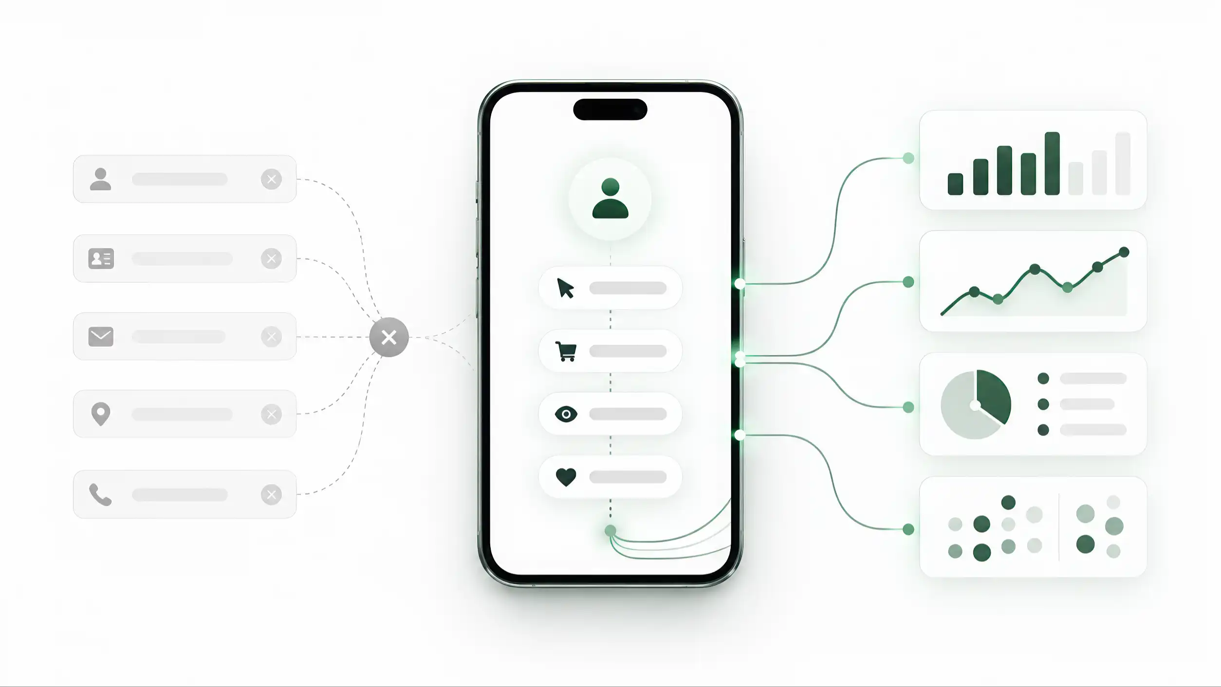
QR produces a simple metric that businesses naturally want to count: scans. That number can be useful. It can show whether a placement is being used, compare traffic between locations, identify sudden changes, and help teams understand whether the physical invitation is attracting attention. But scan count is an access metric, not a complete measure of value.
Two QR placements can produce the same number of scans and create very different outcomes. One may send visitors to a clear, relevant page where many continue to the intended action. Another may attract curiosity but lose most people after the destination opens. If reporting stops at scan volume, those two experiences appear equal.
The useful next layer is post-scan behaviour. Did the destination load successfully? Did the visitor reach the relevant content? Did they use the main action? Depending on the context, that action might be viewing a menu, opening directions, saving contact details, leaving a review, opening product information, booking, calling, or continuing to another controlled page.
This article does not need to define a complete analytics taxonomy; that belongs in a dedicated measurement framework. The important principle is narrower: measurement should follow the purpose of the placement. A QR code that exists to generate reviews should be evaluated differently from one that exists to deliver a menu or route a customer to support.
It is also important not to overstate causality. A scan is not a sale. A click is not necessarily a completed task. Some useful outcomes happen later. A person may scan a business card, save the contact, and call three days afterward. A visitor may view product details and purchase through another channel. Analytics helps reveal patterns; it does not make every customer journey perfectly attributable.
A practical dashboard can therefore remain selective. Track scan or open volume, successful destination loads, a small number of context-specific actions, and trends over time. If different physical placements have distinct identifiers, compare them. The goal is to learn which locations and destinations produce useful behaviour, not to collect every possible event simply because the technology allows it.
Privacy should remain proportionate as well. Many operational questions can be answered with aggregated counts and action rates without identifying individual people. If the business only needs to know whether a menu stand is being used or whether a review prompt produces reviews, collecting unnecessary personal data adds risk without improving the decision.
The most useful question is therefore not “How many people scanned?” It is “What proportion of scans turned into the behaviour this placement was designed to support?” That question keeps the measurement connected to the actual purpose of the QR experience.
The practical standard: clear promise → easy scan → relevant page → useful action
A strong QR experience can be evaluated as a chain rather than as a symbol. The code is one link between a physical invitation and a digital result. If the business judges only the square itself, it misses most of the experience the customer actually feels.
The first test is the promise. Does the physical context tell the visitor why they should scan? A visible code with no explanation may work when the purpose is obvious, but in many settings a short result-oriented instruction reduces uncertainty. The message should describe the benefit or task rather than celebrate the technology.
The second test is access. Can ordinary users find and scan the code under realistic conditions? Is the final print readable? Is the placement natural? Does glare, distance, material, or surrounding design make scanning awkward? If the physical interaction fails, the destination never gets a chance to prove its quality.
The third test is relevance. Does the page that opens match the reason for scanning? This is where generic homepages often fail. The destination should preserve the context created by the physical object and confirm immediately that the visitor reached the right place.
The fourth test is mobile usability. The first screen should load quickly, work on the device already in the user’s hand, and establish orientation and priority without making the visitor decode the interface. Luke Wroblewski, Steve Krug, and Don Norman approach design from different angles, but all reinforce the same practical direction: design around real user conditions, make intended actions understandable, and remove avoidable effort.
The fifth test is the useful action. What should the visitor be able to do next? The answer should come from the purpose of the placement: open the menu, save the contact, leave the review, get directions, read the product information, book, call, or continue another defined task. The page can contain more, but the primary job should be unmistakable.
The sixth test is measurement and maintenance. Can the business tell whether the placement is being used and whether visitors continue? Can broken destinations be detected? Are links, redirects, languages, and content checked after site changes? QR is often printed on physical materials that remain in circulation after the website around them changes, so basic operational ownership matters even when detailed link-lifecycle architecture is handled elsewhere.
This framework also clarifies when QR is not the best choice. If the user already has the information on screen, if the destination could be reached more directly, or if the environment makes camera scanning awkward, another access method may be better. Technology should reduce friction in context rather than be added for appearance.
The best QR experiences make the code almost disappear from memory. The user does not leave thinking about finder patterns or scanning mechanics. They remember that the menu opened, the directions were clear, the review was easy, or the information they needed appeared immediately. That is the standard worth designing for: not a successful scan, but a successful continuation of the task.
Sources
- Believing in a Faint Light: Obstacles QR Code Developer Overcame and the Source of His Idea — Masahiro Hara — DENSO
- Don't Make Me Think, Revisited: A Common Sense Approach to Web Usability — Steve Krug — New Riders / Pearson
- The Design of Everyday Things — Don Norman — Basic Books
- Mobile First — Luke Wroblewski — A Book Apart
- 2D Barcodes — Consumer Engagement — GS1